
How to Automate Client Reporting as a Virtual Assistant (2026)
Disclosure: This article contains affiliate links. If you purchase through them, VA Automation Lab earns a commission at no additional cost to you. All tools are evaluated independently.
The complete system for automated client reporting: the tools, the four-layer architecture, a step-by-step workflow you can build today, and the AI layer that handles the written narrative automatically. Every section is actionable. There are no tools here that require coding, a developer, or a budget above $25/month.
Automating client reporting is one of the highest-return workflow projects a VA can build, and one of the most consistently neglected. Every VA with more than two retainer clients is rebuilding the same report structure every week: open the project tool, export the numbers, copy them into a spreadsheet, write a summary, format it, send it before the deadline. Different client. Same process. Same 2–4 hours.
The problem is not that reporting is difficult. It is that the mechanical part of it (data collection, formatting, and delivery) requires no judgment, adds no value, and scales linearly with client count. Research from Wishup’s 2026 VA Industry Report documents what most experienced VAs already suspect: with the right automation stack, a report that previously took 2–3 hours to produce takes under 20 minutes, most of which is review rather than production.
What this guide covers:
- The four components of a client report and exactly which ones can be automated
- The five most common report types VAs produce, and the automation opportunity for each
- The 4-layer automated client reporting stack: collection, automation, visualization, and AI narrative
- A step-by-step workflow to build your first fully automated weekly client report
- Google Data Studio: what you get for free and how to set it up in under an hour
- How to use ChatGPT or Claude to generate the written narrative section automatically
- Why Make is the stronger backbone for a multi-client reporting system, and when Zapier still makes sense
- Automated client reporting workflows by VA service type
- How to scale the system across multiple clients without rebuilding it each time
- The six mistakes that break reporting automation, and how to avoid them
- The real ROI of automating reporting, with a worked time-and-cost example
➡️ Already using AI for other tasks? See the complete tool stack in AI Tools for Virtual Assistants: The Complete Practical Guide.
➡️ Automation for Virtual Assistants: The Complete Guide — for a broader automation context for VA workflows covering six workflow categories and the full tool stack.
Get the Free AI Toolkit for Virtual Assistants
Automated client reporting is one piece of a complete AI-powered VA workflow.
The free toolkit includes the tools, templates, and checklists that complement every system in this guide, including a reporting workflow checklist and a Google Sheets hub template.
Built for freelance VAs, curated for practical daily use.
Table of Contents
1. What Automated Client Reporting Is
Automated client reporting is the use of software to pull data from your client tools, process it into key metrics, visualize it in a live dashboard, and deliver a finished report on a set schedule — with little to no manual work. For a virtual assistant, it converts a recurring 2–4 hour weekly reporting task into a 15-minute review-and-send.
Automated client reporting is not the same as AI-generated reporting, and the distinction matters for how you build it. The goal is not to hand everything to a machine and walk away. It is to remove the mechanical, repetitive steps from your workflow so your time goes where it belongs: reviewing outputs, applying context, and communicating with clients.
A complete client report has four components. Understanding which of these are automatable, and which still require your judgment, determines what you build and what you protect.
Component 1: Data collection
Pulling numbers from multiple tools, a project management platform, a social media analytics dashboard, a time tracker, a CRM. This is the most time-consuming component of manual reporting and the most automatable. Automation can handle 90–100% of structured data collection without human input.
Component 2: Data processing
Formatting, calculating, and organizing raw data into usable summaries: completion rates, comparison to previous period, budget vs. actual. This is largely automatable using Google Sheets formulas and Make‘s data transformation modules. The VA’s role here shifts from doing the calculation to verifying the result.
Component 3: Visualization
Presenting the data in a readable, professional format, charts, scorecards, tables, dashboards. Once built, a Google Data Studio dashboard updates automatically when the underlying data updates. The VA’s role becomes maintaining the template, not rebuilding it each cycle.
Component 4: Narrative writing
The paragraph that explains what the data means: what changed, why it matters, what should happen next. This is the component that still requires human judgment in its final form. AI tools (ChatGPT, Claude) now generate a strong first draft from structured data in seconds, the VA reviews, edits for accuracy and client context, and sends. The thinking remains yours.
The practical outcome of a well-built automated client reporting system: a report cycle that previously took 2–4 hours per client per week takes 15–20 minutes of review and sign-off. That time saving compounds across every client and every reporting cycle for as long as the system runs.
One expectation to set before building: the setup investment is real. Building the full stack in this guide takes 4–6 hours on the first client. The return on that investment begins with the second reporting cycle and compounds indefinitely.
2. The Five Report Types VAs Automate Most
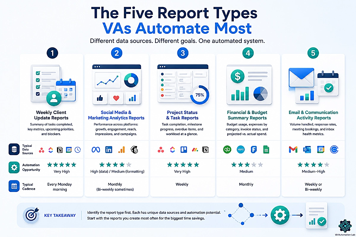
Before choosing tools, identify which report type you produce. Each has different data sources, different client expectations, and a different level of automation feasibility.
Weekly Client Update Reports
The most common VA deliverable: a short document or email summarizing tasks completed, metrics relevant to the client’s goals, upcoming priorities, and any blockers.
- Typical data sources: Asana, ClickUp, Notion, Google Calendar, time-tracking tools
- Automation opportunity: ⭐⭐⭐⭐⭐ Very high, data already exists in structured, queryable form
- Typical cadence: Every Monday morning
Social Media and Marketing Analytics Reports
Performance summaries covering follower growth, engagement, reach, impressions, and campaign results across one or more platforms.
- Typical data sources: Meta Business Suite, LinkedIn Analytics, Google Analytics 4, Mailchimp / Kit
- Automation opportunity: ⭐⭐⭐⭐ High for data collection; medium for formatting (platform export formats vary)
- Typical cadence: Monthly, sometimes bi-weekly
Project Status and Task Reports
Used by VAs supporting project managers or operations leads, task completion rates, milestone progress, overdue items, and workload distribution at a glance.
- Typical data sources: Asana, ClickUp, Trello, Monday.com, Notion databases
- Automation opportunity: ⭐⭐⭐⭐⭐ Very high, all major PM tools have structured data accessible via Make/Zapier
- Typical cadence: Weekly
Financial and Budget Summary Reports
Monthly summaries showing budget usage, expenses by category, invoice status, and projected vs. actual spend.
- Typical data sources: QuickBooks, Xero, FreshBooks, client-maintained Google Sheets
- Automation opportunity: ⭐⭐⭐ Medium, financial data requires manual review and reconciliation before delivery
- Typical cadence: Monthly
Email and Communication Activity Reports
Used by executive assistants: volume handled, response rates, meeting bookings, and inbox health metrics.
- Typical data sources: Gmail, Outlook, Google Calendar, Calendly
- Automation opportunity: ⭐⭐⭐⭐ Medium-high, depending on how structured the client’s existing inbox management is
- Typical cadence: Weekly or bi-weekly
👉 Best Automation Workflows for Virtual Assistants: Complete Guide — covers the underlying task management automations that feed clean data into this reporting layer.
3. The 4-Layer Automated Client Reporting Stack
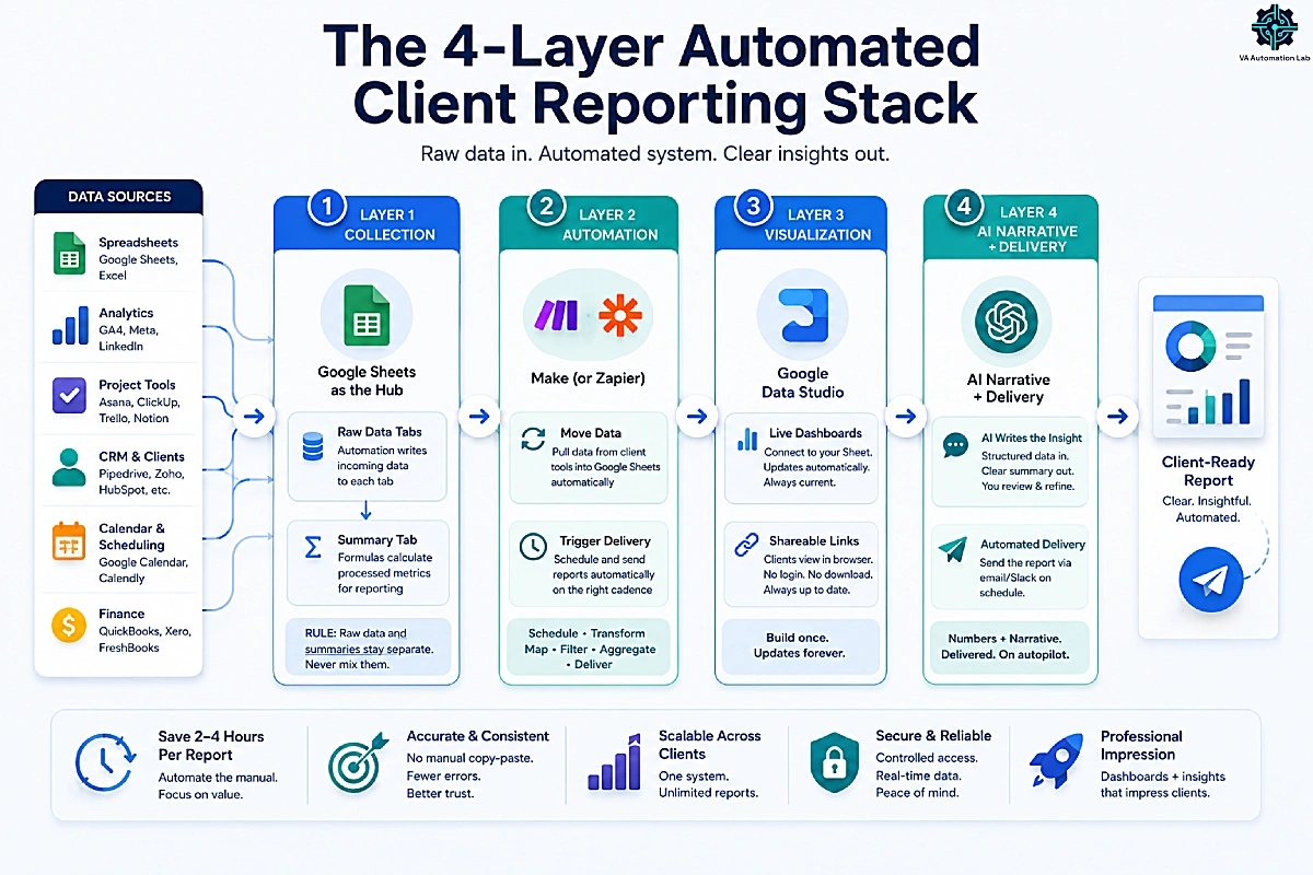
The automated client reporting stack has four layers. Each layer has a specific function, and each feeds the next. Understanding the architecture before selecting tools prevents the most common setup mistake: choosing a tool that solves one layer while ignoring the others, then wondering why the system still requires manual work.
[Data Sources] → [Layer 1: Collection] → [Layer 2: Automation] → [Layer 3: Visualization] → [Layer 4: AI Narrative + Delivery]
Layer 1 — Data Collection: Google Sheets as the Hub
Google Sheets is the backbone of this stack for three reasons: it is free, it connects natively to the Google ecosystem, and it is the one tool that clients and VAs universally know how to open without a tutorial.
Every data source gets its own tab. Automation (Layer 2) writes incoming data to those tabs automatically. A separate Summary tab uses Google Sheets formulas to calculate the processed metrics that Layer 3 visualizes.
The rule that makes the system maintainable: raw data in one tab, processed summaries in another. Never mix them. Raw data tabs accept automation without formatting constraints. Summary tabs use formulas only, no manual entries that automation could overwrite.
Layer 2 — Automation: Make (or Zapier)
This layer does two things: it moves data from client tools into your Google Sheet, and it triggers the delivery of the finished report on a schedule. For a reporting system you will run across multiple clients, Make is the stronger backbone: its free plan runs the full multi-step workflow (Zapier’s free plan caps at two steps, which a reporting workflow exceeds immediately), its paid plan costs roughly half as much, and its routers and aggregators handle the data-shaping that reporting needs natively. Zapier is the gentler interface if you want the simplest possible first automation. The full decision framework is in Section 7.
Layer 3 — Visualization: Google Data Studio
Data Studio connects to your Google Sheet and transforms it into a live, shareable dashboard. Once built, it updates automatically when the Sheet updates. Clients access it via a link, no login required, nothing to download. You build the dashboard once and never reformat it again. Section 5 covers the complete setup.
Layer 4 — AI Narrative + Delivery
The least-used layer in most VA workflows, and the highest-leverage one for time savings. An AI model receives structured data from your report and generates the written summary section, the paragraph that tells the client what the numbers mean. You review and edit. The thinking remains yours; the blank-page problem disappears.
Section 6 covers the prompt template and both the automated (Make-integrated) and manual versions of this step.
Total Cost of the Automated Client Reporting Stack
One of the most underrated properties of this stack is how little it costs to run. Each layer has a free tier that covers a solo VA’s first reporting client, and the only layer with a meaningful paid step is automation, once you scale past one client.
Layer | Tool | Free Tier Covers | Paid Tier (if needed) |
1. Collection | Google Sheets | Unlimited use | Not applicable, always free |
2. Automation | Make | Building and testing one full workflow | Make Core, $9/month, once running live for multiple clients (10k credits) |
3. Visualization | Data Studio | Unlimited dashboards, 20 Google connectors | Data Studio Pro — agency features, not needed by most VAs |
4. AI Narrative | ChatGPT or Claude | Manual copy-paste workflow (Section 6, Option B), no cost | A few cents per report when called via API inside the automated workflow, negligible at typical reporting volume |
The practical floor: a VA running this stack for their first one to two clients can do so entirely on free tiers. The first real cost most VAs hit is Make Core at $9/month billed annually, which includes 10,000 credits a month, and only once reporting volume across multiple clients exceeds what the free plan’s credit allowance covers. Section 11 walks through what that $9/month buys back in reclaimed time.
4. How to Build Your First Automated Client Report: Step-by-Step
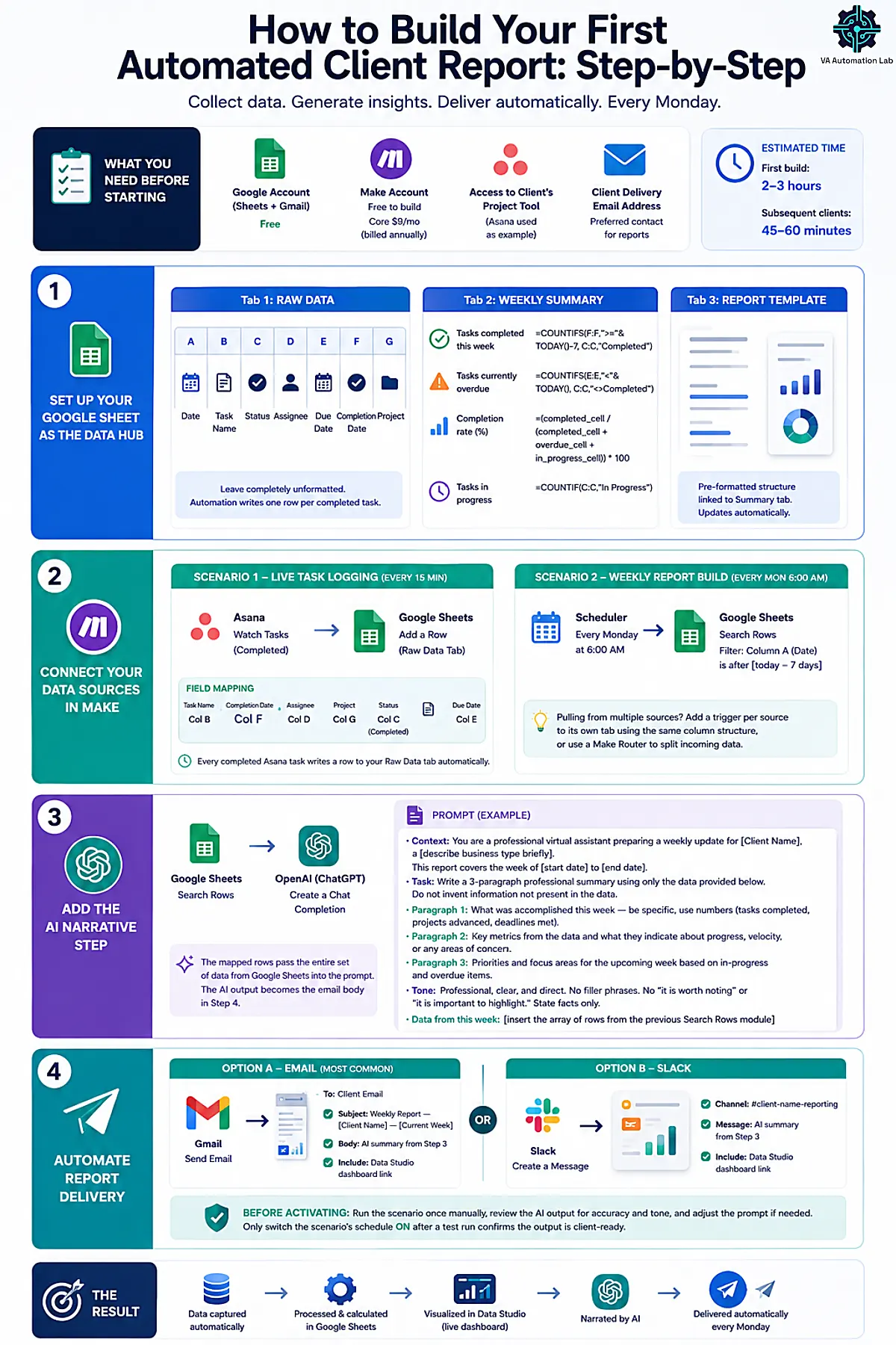
This workflow produces a fully automated weekly task and project summary. Data is collected from a project management tool, processed in Google Sheets, narrated by AI, and delivered by email every Monday morning, without manual input. We build it in Make: it has a steeper learning curve than Zapier, but a far more capable free tier and a cheaper paid plan, so the system you build here scales to more clients without a later migration.
New to the platform? The Make Beginner Setup Guide walks through the workspace basics first.
What you need before starting:
– A Google account (Sheets + Gmail) free
– A Make account — the free plan builds and tests this; Make Core ($9/month billed annually) once you run it live for clients
– Access to the client’s project management tool (Asana used as example throughout)
– The client’s preferred delivery email address
Estimated setup time: 2–3 hours on first build. Subsequent clients: 45–60 minutes using a duplicated workflow.
Step 1 — Set Up Your Google Sheet as the Data Hub
Create a new Google Sheet. Name it clearly: [Client Name] — Reporting Hub.
Tab 1: “Raw Data”
Seven columns (A through G) covering Date, Task Name, Status, Assignee, Due Date, Completion Date, and Project. Leave this tab completely unformatted, no merged cells, no conditional formatting, no color fills. Automation writes one row per completed task directly into this tab and requires a clean, predictable column structure to map fields correctly. See the full column reference table at the end of this section.
Tab 2: “Weekly Summary”
This tab calculates. Use these formulas in clearly labeled cells:
Tasks completed this week: =COUNTIFS(F:F,">="&TODAY()-7, C:C,"Completed")Tasks currently overdue: =COUNTIFS(E:E,"<"&TODAY(), C:C,"<>Completed")Completion rate (%): =(completed_cell / (completed_cell + overdue_cell + in_progress_cell)) * 100Tasks in progress: =COUNTIF(C:C,"In Progress")
Tab 3: “Report Template” (optional but recommended)
A pre-formatted structure referencing cells from the Summary tab. When the Summary tab updates, the Report Template updates automatically. No reformatting required before sending.
Step 2 — Connect Your Data Sources in Make
Scenario 1 — Live task logging (runs on an interval):
TRIGGER: Asana → "Watch Tasks" (filtered to completed tasks)MODULE: Google Sheets → "Add a Row"Field mapping:Task Name → Column BCompletion Date → Column FAssignee → Column DProject → Column GStatus → Column C (set to "Completed")Due Date → Column E
Set the scenario to run on a schedule (every 15 minutes on the free plan, down to every minute on Core). From this point, every completed Asana task writes a row to your Raw Data tab automatically.
Scenario 2 — Weekly report build and delivery (runs on a schedule):
SCHEDULE: Set the scenario to run every Monday at 6:00 AM MODULE: Google Sheets → "Search Rows" Filter: Column A (Date) is after [today - 7 days]
This scenario feeds the AI summary and delivery modules in Steps 3 and 4. If you pull from more than one source (e.g., Asana + a social media tool), add a separate trigger module per source pointing to its own tab in the same Google Sheet using the same column structure — or use a Make Router to split incoming data by source within a single scenario.
Step 3 — Add the AI Narrative Step
In the same scheduled Monday scenario (after the “Search Rows” module), add:MODULE: OpenAI (ChatGPT) → "Create a Chat Completion" OR Anthropic Claude → "Create a Message"
Paste this prompt in the action field, replacing the placeholders:
Context: You are a professional virtual assistant preparing a weekly update for [Client Name], a [describe business type briefly].
This report covers the week of [start date] to [end date].
Task: Write a 3-paragraph professional summary using only the data provided below. Do not invent information not present in the data.
Paragraph 1: What was accomplished this week — be specific, use numbers (tasks completed, projects advanced, deadlines met).
Paragraph 2: Key metrics from the data and what they indicate about progress, velocity, or any areas of concern.
Paragraph 3: Priorities and focus areas for the upcoming week based on in-progress and overdue items.
Tone: Professional, clear, and direct. No filler phrases. No "it is worth noting" or "it is important to highlight." State facts only.
Data from this week: [insert the array of rows from the previous Search Rows module]
The output of this module becomes the body of the report email in Step 4. The mapped rows pass the entire set of row data from the Google Sheet into the prompt automatically.
Step 4 — Automate Report Delivery
Continuing the same Monday scenario, add the delivery module:
Option A — Email (most common):
ACTION: Gmail → "Send Email"
To: [client email]
Subject: Weekly Report — [Client Name] — [Make date variable: current week]
Body: [AI summary output from Step 3]
[Data Studio dashboard link — added after Section 5 setup]
Option B — Slack:
ACTION: Slack → "Create a Message"
Channel: #[client-name]-reporting
Message: [AI summary from Step 3]
Dashboard: [Data Studio link]
Before activating: Run the scenario once manually, review the AI output for accuracy and tone, and adjust the prompt if needed. Only switch the scenario’s schedule on after a test run confirms the output is client-ready.output is client-ready.
Column | Header Label | Content | Populated by |
A | Date | Date the task was completed | Automation |
B | Task Name | Full name of the completed task | Automation |
C | Status | Completed / In Progress / Overdue | Automation |
D | Assignee | Name or email of the person responsible | Automation |
E | Due Date | Original deadline from the PM tool | Automation |
F | Completion Date | Date the task was marked complete | Automation |
G | Project | Project or client area the task belongs to | Automation |
Client reporting is one layer of a broader system. This guide on Client Management Systems for Virtual Assistants shows how reporting fits into a complete workflow alongside CRM, onboarding, and automation.
5. Google Data Studio: The Free Dashboard Layer
Google Data Studio is the right visualization tool for most VA reporting setups because of one property: it is completely free, connects natively to Google Sheets, and clients can view the dashboard via a shared link with no account, no login, and nothing to install.
You build the dashboard once. When the Google Sheet updates, the dashboard updates. You never reformat the visualization again.
What the Free Tier Includes
The 20 built-in Google connectors cover every data source most VAs work with: GA4, Google Ads, Google Sheets, Search Console, YouTube Analytics, BigQuery, and more. Standard scheduled email delivery of report snapshots is also included free. For independent VAs using Google Sheets as the central data hub (populated via Make or Zapier), the free tier is sufficient with no exceptions.
Data Studio Pro adds Team Workspaces, chart-based threshold alerts, and delivery to Slack or Google Chat. These features serve agencies managing multiple sub-accounts, not individual VAs.
Basic Setup: Google Sheet → Data Studio Dashboard
- Go to datastudio.google.com and sign in with your Google account
- Click Create → Report
- Select Google Sheets as the data source — choose your Weekly Summary tab
- Add components:
- Scorecard for each key metric (tasks completed, completion rate, overdue count)
- Table for detailed task breakdown
- Bar or Line Chart for completion trend over previous 4 weeks
- Apply brand colors using the Theme and Layout editor (under View)
- Click Share → Manage access → Anyone with the link can view
- Copy the link and add it to your Step 4 email template
Total build time for a first dashboard: 45–75 minutes. Duplicating the dashboard for a second client with the same report type: 15–20 minutes.
One Important Limitation to Know
Data Studio’s free connectors cover the entire Google ecosystem. For non-Google sources (LinkedIn Ads, Shopify, HubSpot, Klaviyo), you need a paid third-party connector such as Supermetrics or Funnel, which have their own monthly costs.
The Google Sheets hub strategy from Section 4 sidesteps this entirely. By routing all data through Sheets first via Make or Zapier, regardless of the original source, you give Data Studio a single, clean data source it can always connect to for free.
When to Graduate to a Purpose-Built Reporting Tool
For most VAs, the free Google Sheets + Data Studio stack covers client reporting indefinitely. But a few situations make a dedicated reporting platform worth considering: you are running reporting for five or more clients and dashboard-rebuilding overhead is mounting, your clients pull from many non-Google sources (Meta, LinkedIn, HubSpot, Shopify) and the connector workarounds are getting fragile, or you need white-labeled, client-ready reports under your own brand rather than a Google dashboard link.
A purpose-built tool like Databox is built for exactly this. It connects directly to dozens of the major ad, analytics, CRM, and social platforms and ships pre-built dashboard templates, so you get the same outcome as the DIY stack with the setup and maintenance time removed. Its free plan (three data sources, one dashboard) is enough to test the fit against your current workflow, and paid plans start at $71/month billed annually — the Analyst tier, covering five data sources for one user, which is the realistic entry point for a solo VA whose reporting has outgrown spreadsheets.
Fully white-labeled, client-branded reporting is a separate premium add-on, worth it only when your own branding on every dashboard is a firm requirement. A 14-day trial covers the paid features before you commit.
The sequence: start free with Sheets + Data Studio, prove the workflow, and only move to a paid platform once reporting volume or branding requirements justify the cost. Graduating early is a cost with no return; graduating at the right time is leverage.
See whether a dedicated reporting tool fits your client load.
6. How to Automate the Narrative Section with AI
The section of a client report that clients read is not the data table. It is the paragraph that tells them what the data means. Most VAs write this section manually every week because it feels like it requires judgment. It does, but AI handles the draft, and your review provides the judgment.
Time investment with AI: 30 seconds to generate the draft, 5 minutes to review and edit.
Without AI: 20–30 minutes writing from scratch.
Option A — Integrated Automation (Fully Automatic)
Set up the ChatGPT or Claude step directly in your scheduled Monday scenario as described in Step 3 above. The narrative is generated automatically from the week’s data, inserted into the email body, and sent without opening a browser.
This is the highest-leverage implementation for VAs managing 3+ reporting clients, because each client uses the same Scenario structure with different data and a different system prompt.
Option B — Manual Prompt (Simpler, No API Required)
Keep the prompt template from Step 3 saved in a text expander (TextExpander) or in a Notion database. Each week, paste that week’s summary data, run the prompt in Claude or ChatGPT, copy the output, review, and send. This trades full automation for simplicity but still cuts writing time by 70–80%.
Prompt Template — Copy-Ready
Context: You are a professional virtual assistant preparing a weekly update for [Client Name], a [describe business type briefly].
This report covers the week of [date range].

Task: Write a 3-paragraph professional summary using only the data provided below. Do not invent information not in the data.

Paragraph 1: Accomplishments this week — specific, numbers included.
Paragraph 2: Key metrics and what they indicate.
Paragraph 3: Priorities for the coming week based on open items.

Tone: Professional, direct, no filler language. Facts only.

Data: [Paste your Weekly Summary tab data here]
What to Edit Before Sending
The AI draft handles structure and factual accuracy from the data provided. Before sending, add:
- Client-specific context the AI cannot know: decisions made in a call that week, tone adjustments for your relationship with this client, upcoming events or launches not captured in the task data
- Verification of numbers: confirm that the figures in the AI summary match your source data exactly before delivery
This review step keeps the report useful rather than generic, and protects your professional reputation if the AI has misread the data structure.
For more on building AI-assisted written outputs for client deliverables, the ChatGPT for Virtual Assistants guide covers the full prompt architecture for client communication tasks, and the Claude AI guide for VAs covers longer-form analysis and document generation.
7. Zapier vs. Make for Client Reporting Workflows
The Complete Zapier vs. Make Comparison covers both platforms in full. For automated client reporting specifically, the decision reduces to a single variable: how many clients you are running reporting for, and how complex the conditional logic needs to be.
Decision Framework
Scenario | Recommended Tool | Reason |
You want the simplest possible interface for a first-ever automation | Zapier | Gentler learning curve, Copilot for troubleshooting |
You are building a reporting system to run across multiple clients | Make | Free tier runs the full multi-step workflow; far cheaper at scale |
≤3 clients, lowest learning curve, cost is secondary | Zapier Professional | Simple and sufficient — but pricier than Make |
4+ clients, cost efficiency matters | Make Core | 10,000 credits/month — far more capacity for less |
Workflow needs conditional logic (e.g., “if completion rate <70%, flag as critical”) | Make | Native Routers — Zapier cannot branch the same way |
Need to aggregate and transform row data within the workflow | Make | Array aggregators and iterators handle this natively |
Pricing Comparison for Reporting Workflows
Platform | Plan | Monthly Cost (annual) | Credits / Tasks |
Zapier | Free | $0 | 100 tasks — insufficient for multi-step workflow |
Zapier | Professional | $19.99 | 750 tasks — sufficient for ≤3 clients |
Make | Free | $0 | 1,000 credits — sufficient for testing one client |
Make | Core | $9 | 10,000 credits — sufficient for 5–10 clients |
The practical starting point for most VAs: Zapier Professional. It is the simpler tool, and from $19.99/month billed annually it covers the reporting needs of the typical VA with 2–4 retainer clients without hitting the task ceiling. Migrate specific high-volume workflows to Make when Zapier’s 750-task limit becomes the constraint.
The practical starting point for most VAs building a reporting system: Make. A multi-step reporting workflow exceeds Zapier’s free two-step limit immediately, so Zapier costs from $19.99/month from day one — while Make runs the same workflow on its free plan and charges $9/month for 10,000 credits once you scale. Add Make’s native routers and aggregators (which reporting leans on for conditional flags and data shaping), and building on Make from the start avoids a painful migration later. Choose Zapier only if you want the simplest possible interface for a first-ever automation and are comfortable paying more for it.
Start building your reporting automations on Make
Make’s Core plan ($9/month billed annually) gives 10,000 credits a month — enough to run automated weekly reporting for 5–10 clients without hitting limits, and the free plan’s 1,000 credits cover building and testing a full workflow before you upgrade.
It is the most cost-efficient way to run conditional routing and data aggregation at multi-client scale.
8. Automate Client Reporting by VA Service Type
Different VA specializations produce different reports and need different automation setups. Use this section to identify your setup path without reading sections that don’t apply to your work.
VA Type | Primary Data Source | Automation Layer | Visualization | Report Cadence |
Social Media VA | Meta Business Suite, GA4, email platforms | Manual export → Google Sheets (or Make where API available) | Data Studio analytics dashboard | Monthly |
Executive Assistant VA | Asana / ClickUp, Google Calendar | Make → Google Sheets | Email summary (no dashboard required) | Weekly |
Project Coordinator VA | Asana, Monday.com | Make (multi-project routing) | Data Studio milestone tracker | Weekly |
Bookkeeping Support VA | QuickBooks, Xero | Manual monthly export → Google Sheets | Data Studio financial summary | Monthly |
Social Media VA
Minimal stack: Meta Business Suite native export (monthly CSV) → Google Sheets → Data Studio analytics dashboard.
Key report: Monthly performance summary, follower growth, engagement rate, reach, top-performing posts by type, content category breakdown.
AI layer: “Compare this month to last month across all platforms and identify which content category performed best. Flag any metric that changed by more than 15% in either direction.”
Note: Direct API access for social platforms varies. The CSV-to-Sheets route is the most reliable and requires no paid connector.
When manual export stops scaling: the CSV route works fine for one or two social clients, but it gets tedious fast once you are pulling from multiple platforms across several accounts every month. Metricool is built specifically for this case: it natively aggregates analytics across Instagram, Facebook, X, LinkedIn, TikTok, YouTube, and Pinterest in one dashboard, and generates branded, exportable reports directly, no Google Sheets relay step required. It is worth evaluating once social reporting for 3+ clients starts eating into the time this whole stack is meant to save.
👉 Social Media Automation for Virtual Assistants: Tools, Workflows & Complete System — the full posting, scheduling, and analytics stack that feeds this reporting layer.
Executive Assistant VA
Minimal stack: Asana or ClickUp → Make → Google Sheets → Gmail delivery.
Key report: Weekly task completion summary, calendar utilization (meetings attended vs. available slots), inbox zero status, any escalation items.
AI layer: “Write a 2-paragraph executive summary of the week’s outputs. Identify any recurring patterns in the types of tasks that generated the most questions or required re-work.”
Project Coordinator VA
Minimal stack: Asana or Monday.com → Make (for multi-project conditional routing) → Google Sheets → Data Studio milestone tracker.
Key report: Project health dashboard, milestone completion %, overdue tasks by project, team workload distribution, days to next deadline by project.
AI layer: “Flag any project where more than 20% of tasks are overdue. For each flagged project, generate a 2-sentence risk summary.”
Why Make over Zapier here: Multiple active projects with different client contexts benefit from Make’s Router module, which routes data to different tabs based on project name or status without building a separate Zap per project.
Bookkeeping Support VA
Minimal stack: QuickBooks or Xero → manual monthly export → Google Sheets → Data Studio financial summary.
Key report: Monthly budget vs. actual spend, expense breakdown by category, invoice aging table, overdue payments.
AI layer: “Summarize the month’s financial position in 2 paragraphs. Note any budget variance above 10% by category. Flag any invoice aging beyond 30 days.”
⚠️ Financial reports require manual verification before delivery. The AI layer produces a first draft, it does not replace reconciliation. Never send an AI-generated financial summary without checking every number against source data.
9. How to Scale Automated Reporting Across Multiple Clients
The single-client setup in Section 4 scales, but only if it was built with duplication in mind. VAs who build each client’s reporting system from scratch face compounding maintenance overhead. VAs who build a standard template and adapt it for each client scale linearly.
The Three Standardization Rules
Rule 1: Use an identical column structure across all client Google Sheets. If every client’s Raw Data tab uses columns A–G in the same order with the same headers, your Data Studio dashboard template and your AI prompt work identically for every client. Changing the column order for one client breaks both.
Rule 2: Name your sheets consistently. [Client Name] — Reporting Hub as the file name, Raw Data, Weekly Summary, Report Template as the tab names. Consistent naming means the same Make field mapping works for every client without reconfiguring.
Rule 3: Duplicate, don’t rebuild. When onboarding a new reporting client: duplicate the template Google Sheet (File → Make a Copy), rename it, connect the new client’s data source to the existing Zap structure by creating a new scenario with identical mapping pointing to the new Sheet, and duplicate the Data Studio dashboard (Edit → Make a Copy in Report Settings). Total setup time per additional client: 45–60 minutes.
At What Point Does Make Become More Cost-Efficient Than Zapier?
The tipping point is approximately 4–5 active reporting clients on weekly cycles. At that volume:
- Each client uses roughly 4 tasks per weekly run (trigger + data pull + AI summary + email)
- 5 clients × 4 tasks × 4 weeks = ~80 tasks/month for reporting alone
- With other automation running in parallel, Zapier’s 750-task Professional limit fills up quickly
- Make’s Core plan at $9/month gives 10,000 credits — a 13× headroom increase at roughly half the price
👉 How to manage multiple clients as a VA using AI — the complete framework for managing multiple clients, including how this reporting stack integrates with client communication and task management.
10. Common Mistakes VAs Make When Automating Reports
Building dashboards clients don’t use
A Data Studio dashboard is only valuable if the client opens it. Before investing 2 hours in dashboard setup, ask: does this client prefer a live dashboard link, a PDF snapshot attached to an email, or a formatted summary in Slack? Build for the format they will open, not the one that looks most impressive.
Automating before validating source data
If the source data is inconsistent (tasks with missing dates, social metrics exported incorrectly, status labels not applied uniformly) automated client reporting faithfully reproduces that inconsistency every week. Spend the first week of a new client engagement auditing data quality before building automation on top of it. Clean data first, automation second.
Starting on a tool whose free plan can’t run the full workflow
A complete reporting workflow requires at minimum four steps: trigger → data pull → AI summary → delivery. Zapier’s free tier caps at 2-step Zaps (one trigger, one action) and 100 tasks per month, so a multi-step reporting build hits the wall immediately and forces an upgrade to Professional (from $19.99/month billed annually) before you have even tested the workflow. Make’s free plan runs the full multi-step scenario described in this guide, so you can build and test the entire system before paying anything. Building on the wrong free tier and hitting the wall mid-workflow is the most common setup frustration.
Sending AI-generated summaries without reviewing them
An AI summary sent without human review is a professional liability. AI models can misread data structure, produce rounded numbers that differ from exact figures, or generate generic commentary that doesn’t reflect the client’s specific situation. The review step is 5 minutes. Make it non-negotiable.
Not building failure notifications into automation
When a Zap or Make scenario fails silently ,due to an API change, a rate limit, or a field mapping error, the client either receives no report or receives an incomplete one. In Zapier, enable Error Notifications in account settings. In Make, add an error-handling route to every scenario that sends you a Slack or email notification on failure. Configure this before the workflow goes live.
Not telling clients the system is automated
Clients who later discover their “weekly report” was generated automatically without their knowledge sometimes feel misled, even when the report is high quality. Being transparent about the system: “I’ve built an automated reporting workflow that I review and send each week” increases perceived professionalism rather than reducing it. It signals operational sophistication, which is a legitimate differentiator for a VA charging premium rates.
11. The ROI of Automated Client Reporting: A Worked Example
The numbers below are an illustrative worked example, not a guarantee — your actual hours and rate will differ. They are meant to show how to run the calculation yourself, using your own client count and hourly rate.
The Manual Baseline
A VA running weekly reporting manually for 4 clients, at roughly 3 hours per report (data pull, formatting, writing the summary, formatting and sending), spends about 12 hours a month on reporting alone. At an hourly rate of $35, that is roughly $420 a month, or about $5,040 a year, in time spent on a task that produces no judgment-based value once the system exists.
The Automated Alternative
The same 4-client reporting load, built on the stack in this guide, runs at roughly 15–20 minutes of review per client per week, about 5–6 hours a month total, plus the one-time setup (4–6 hours for the first client, 45–60 minutes per additional client). Tool cost at this volume is Make Core at $9/month for 10,000 credits, or about $108 a year — Data Studio, Google Sheets, and the AI narrative step add no further cost at typical reporting volume.
Metric | Manual Reporting | Automated Reporting |
Time per client per week | ~3 hours | ~15–20 minutes |
Total monthly time (4 clients) | ~12 hours | ~5–6 hours |
Monthly time value (@ $35/hr) | ~$420 | ~$175–210 |
Annual tool cost | $0 | ~$108 (Make Core) |
One-time setup investment | — | 4–6 hrs first client, ~1 hr per additional client |
What This Means for a VA’s Business
The roughly 6–7 hours a month reclaimed is not just time saved, it is capacity freed for billable work or for taking on an additional retainer client. At the same $35/hour rate, that capacity is worth roughly $210–245 a month if redirected to client work, against an annual tool cost of about $108. The setup investment typically pays for itself within the first one to two reporting cycles after launch, and the return compounds with every additional client added to the system using the duplication process in Section 9.
This compounding effect is the real argument for building the system even with only 2–3 clients today: the stack does not get rebuilt as the client roster grows, it gets duplicated. The same logic extends past reporting into the rest of how a VA runs client work; the Client Management Systems Guide covers the broader operational stack this reporting layer plugs into.
One caveat: this return only materializes if the reclaimed hours are redirected, toward billable work, business development, or a reduction in working hours. Automating a task and then filling the freed time with unrelated busywork captures none of the financial upside modeled above.
Scale Client Reporting Across Multiple Clients with Make
Make‘s Core plan ($9/month billed annually) gives 10,000 credits per month, enough to run automated weekly reporting for 5–10 clients without hitting limits.
The free plan includes 1,000 operations, which is sufficient to build and fully test a complete reporting workflow before upgrading.
Best for VAs who need conditional routing, complex data aggregation, or cost efficiency at scale.
Frequently Asked Questions About Automating Client Reporting
Can I automate client reporting without knowing how to code?
Yes. The entire stack in this guide (Google Sheets, Make, Google Data Studio, ChatGPT/Claude) requires no coding. Make’s visual scenario builder lets you connect modules and map fields entirely by clicking, with no programming required for standard reporting scenarios. If you want an even gentler first step, Zapier’s Copilot assistant lets you describe a workflow in plain English and generates the equivalent structure for you, though its free plan cannot run this guide’s full multi-step build. Google Sheets formulas (COUNTIFS, SUMIF, AVERAGEIF) are standard spreadsheet functions covered by any Sheets tutorial.
How long does it take to set up automated client reporting for one client?
For the complete stack described here (Google Sheets data hub, Make workflow, AI narrative step, Gmail delivery, and Data Studio dashboard) budget 4–6 hours on first build. For just the Google Sheets + Make + Gmail layer without the dashboard, budget 2–3 hours. After the first client, subsequent setups take 45–60 minutes using a duplicated template
Is Google Data Studio really free? What are the actual limitations?
Yes, the core Data Studio product is free with no time limit. Unlimited dashboards, 20 built-in Google connectors (including GA4, Google Ads, and Google Sheets), real-time data refresh, shareable view-only links, and standard scheduled email delivery are all included at no cost. The only meaningful limitation for VAs is non-Google data sources (LinkedIn Ads, Shopify, HubSpot) which require paid third-party connectors. Using Google Sheets as the central data hub, populated by Make or Zapier from any source, bypasses this limitation.
Which automation plan do I need for reporting, Make or Zapier?
If you build on Make, the free plan runs this guide’s entire multi-step workflow (trigger → data pull → AI summary → delivery) at no cost while you test it; Make Core ($9/month billed annually, 10,000 credits) is what you’ll need once you take it live across multiple clients. If you build on Zapier instead, plan for the Professional tier from the start: Zapier’s free tier caps at 2 steps and 100 tasks/month, which a reporting workflow exceeds immediately, so you need Professional, from $19.99/month billed annually (750 tasks/month, sufficient for roughly 3–4 active reporting clients).
What is the difference between a Zapier “task” and a Make “operation”?
Both count the same unit: each completed action step in a workflow. A Zap with 4 action steps uses 4 tasks per run; a Make scenario with 4 modules uses 4 operations per run. The difference is scale and cost: Zapier Professional gives 750 tasks/month for $19.99. Make Core gives 10,000 credits/month for $9. At high volumes or with multiple clients, Make is significantly more cost-efficient.
Should I use ChatGPT or Claude for the AI narrative step?
Both produce strong results for structured report summaries. Claude tends to produce more structured, analytical prose and handles longer data inputs cleanly, preferable for complex or data-heavy reports. Both platforms offer native modules for ChatGPT and Claude (Make’s “Create a Chat Completion” and “Create a Message” modules, used in the Step 3 build above, configure without any separate API setup), so the choice between models comes down to output quality for your report style rather than setup friction. The ChatGPT for VAs guide and the Claude AI guide for VAs both cover prompt structure for client-facing written outputs.
How do I handle clients who use different project management tools?
Zapier and Make both support all major PM tools (Asana, ClickUp, Notion, Monday.com, Trello). The workflow structure is identical regardless of which tool your client uses, only the trigger integration changes. Because you use the same column structure in every client’s Google Sheet, the Data Studio dashboard and AI prompt template work without modification across all clients.
What happens when automation breaks or a Zap fails?
Configure failure notifications before going live: in Zapier, enable Error Notifications in your account settings; in Make, add an error-handling route to every scenario that sends a Slack or email alert when any module fails. For the client-facing impact, build a brief manual fallback: keep the previous week’s report template formatted and ready to populate quickly in the event of an automation failure. Automation systems require monthly maintenance checks, review execution logs once a month to catch silent degradation before clients notice.
Glossary: Key Reporting Automation Terms for Virtual Assistants
Automated client reporting The practice of using automation tools to collect, process, visualize, and deliver client reports with minimal manual intervention, replacing the manual assembly of data from multiple sources with a system that runs on a schedule.
Trigger The event that starts an automation workflow. In reporting automation, common triggers include a scheduled time (every Monday at 6am), a task being marked complete in a PM tool, or a new row appearing in a Google Sheet.
Action The automated step that executes in response to a trigger. In a reporting workflow, actions include: create a row in Google Sheets, send a prompt to ChatGPT, send an email in Gmail, or post a message in Slack.
Task (Zapier) The unit Zapier uses to count automation usage. Each completed action step in a workflow uses one task. A 4-step Zap (trigger + 3 actions) uses 3 tasks per run. The Professional plan includes 750 tasks/month.
Operation (Make) Make’s equivalent of Zapier’s task. Each module execution in a scenario counts as one operation. Make Core includes 10,000 credits/month.
Zap Zapier’s term for a complete automated workflow: one trigger connected to one or more actions in linear sequence.
Scenario Make’s term for an automated workflow. Unlike Zapier’s linear Zaps, Make scenarios are built on a visual canvas and support branching logic, conditional routers, and data transformation modules.
Data hub The central repository, typically a Google Sheet, where all data from different sources lands before being processed and visualized. In this stack, every client’s reporting system has one data hub that all automation writes to and Data Studio reads from.
Connector The pre-built integration between an automation platform and an external app. Zapier and Make both offer pre-built connectors for Asana, ClickUp, Gmail, Google Sheets, and thousands of others. Data Studio’s built-in connectors link directly to Google ecosystem data sources.
Data Studio Google’s free data visualization and reporting platform (known as Looker Studio from 2022 to April 2026). Connects to Google Sheets and 19 other Google data sources natively, with no cost and no time limit on the free tier. Produces shareable, live dashboards accessible via link with no viewer login required.
AI narrative layer The component of an automated reporting workflow where an AI model (ChatGPT, Claude) receives structured data and generates a written summary section, the “what does this mean” paragraph that clients read. The VA reviews and edits the draft before delivery.
About the Author
Alex Stratton has spent the better part of a decade working at the intersection of virtual assistance and operational systems, first as a VA supporting founders and small business owners, then as a workflow consultant helping remote teams reduce the manual overhead that accumulates when businesses grow faster than their processes. The tools and workflows here reflect decisions made repeatedly in real client contexts, where the wrong choice costs hours, not minutes. Learn more about VA Automation Lab → About.